What is the Right User Interface for Financial Services
When creating fintech UIs, you should maintain simplicity and introduce complicated transactions. Check how not to discourage users after an app download.
The fintech deal activity increased by 11% in the 4th quarter of 2020 compared to the 1st quarter of the same year. The technology is gaining more trust and popularity among customers and the companies should think about responding to the trust. Providing a smooth customer journey supported by the right UI is the best way to do that. Even if you offer demanded financial products at affordable prices, it may all be wiped out by poor visual presentation. In this blog post, we’ll discuss what a good interface is and its key principles regarding fintech solutions.
Improving the digital experience for consumers has become a top priority for financial organizations worldwide in 2020. Fintech software development embraces complicated solutions that can raise questions for the clients. That’s why such designs should be simple for users though provide a sufficient level of security since we are talking about money. Best fintech solutions are designed with care for users and attention to detail. The work of fintech developers can be considered successful when older adults use the solution without difficulty.
The Fively team has experience in working with fintech. The technology requires respect for several principles when you want to accomplish the high-class design. If you’re reading this, you must be ready to provide sufficient customer care and we share the following fintech UI principles at the right time.
Colors
The first thing customers see is colors that can either promote a solution or destroy it. Colors alone influence up to 90% of the first impression. The right palette will help you to put financial products in the proper perspective so that your clients could foresee a positive outcome of their interaction with the solution.
You should keep in mind two things when considering the colors for your future financial solution - your brand positioning and the cultural background of your target audience.
First of all, according to classical color psychology, banks and financial institutions should avoid red as a color of danger, grey as a color of conservatism, and black as a color of evil. Instead, marketers offer green as a color of money, blue as a color of loyalty, and yellow as a color of support. At the same time, the ‘dangerous’ colors are successfully implemented as the accent ones. This approach traditionally works well for financial services and if the ‘safe’ colors fit into your brand vision, do not hesitate to use them.

MoneyLion app is presented in a green color palette so that we think about money with calm
However, there are certain rebels who prefer breaking the rules and betting on young and creative customers or the same rebels in business as they are. Then we may see red color as a provocation, purple color as mystery, orange color as creativity. If that feels like yours, choose appropriate color schemes.

Nubank app relies heavily on purple color and adds stars to make us think about magic
Another important point in choosing color is cultural sensitivity. In China, for instance, red means happiness and prosperity. What is more, red signifies a rise In East Asian stock markets, while North American markets use it to signify a fall. So, if you’re planning to launch your product in a specific region, explore the cultural background.
Progressive Flow
An average mobile app loses 77% of its daily active users within the first 3 days after installation. When it comes to financial services, users are even more scared by the potential complexity of such a solution. Therefore, it’s important to keep the flow simple and smooth when creating UIs for fintech. Do not overload the pages with excessive elements, stick to simplicity. Provide tooltips to explain the terms that can not be omitted and a glossary of all the terms used. The ultimate goal is to make your product understandable for users with different levels of education.
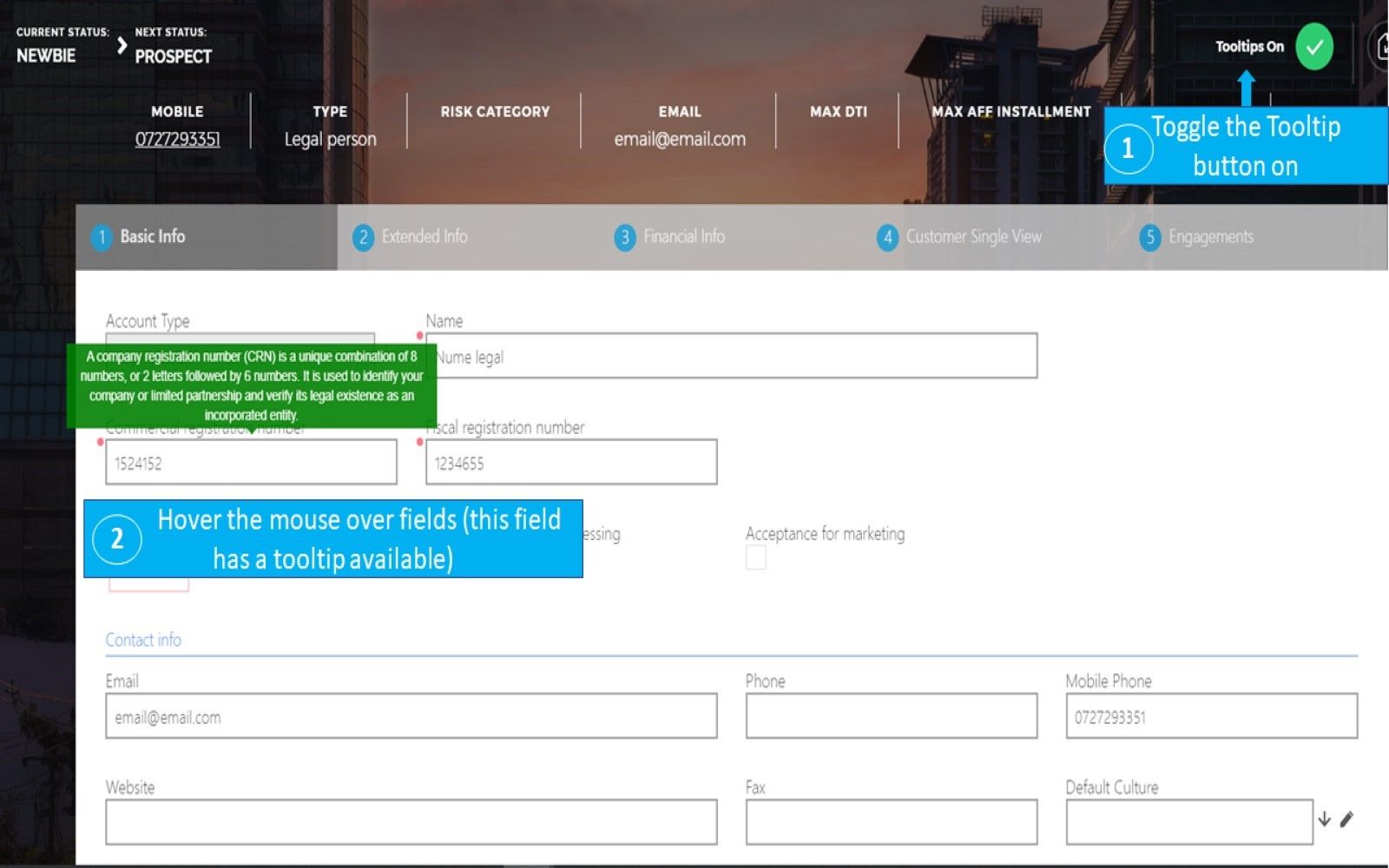
FintechOS demonstrates the usage of tooltips so that customers understand what action to perform
Onboarding experience is one of the most important parts when it comes to user flows. Customers are scared by huge forms and a lot of typing though financial security implies more effort during the registration than it would be with some app for entertainment. You can neither streamline everything nor scare off the users. To resolve this dilemma, divide your onboarding procedure into several parts. In the first part, ask your user for standard personal data like first and last names, date of birth. After that show them a preliminary version of their account and explain how you’re going to use their personal data. In the following part, ask the users for more private financial information.
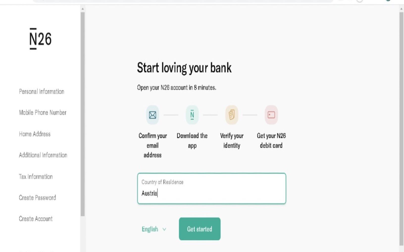
N26 carefully explains how registration takes place
Assistance
The fintech UI is all about giving a helping hand among puzzling operations and figures. Graphics and tooltips help to achieve that, as you already know, but the list of such instruments can be much longer. You should include in it at least one more fundamental concept - animation. Do not forget about the principle of simplicity though. Animation should help users to navigate and inform about the results of action within an app. When it’s smooth and slightly noticeable, the users will perform desired actions and won’t get tired of the animated effects.
You can go further and prepare a voice user interface that is a growing trend in digital banking development. The voice assistance will speed up financial transactions within a solution and make it possible for visually impaired clients to use fintech products.

A typical conversation with a voice assistant. Source: Media Logic
Inspiration Into Action
Now you know how many fabulous ideas you can try when creating a user interface for a financial product. Just don’t forget to stay customer-centric because otherwise, all the effort is in vain. The next step will be to find a development team who cares about customers as much as you do about yours and it looks like we know someone great.

Need Help With A Project?
Drop us a line, let’s arrange a discussion


