How Design and UX Lead to the Greater Conversion Rate in E-commerce
Webstore design and UX can be your game-changer in e-commerce. Discover the tips a successful e-tailer should apply to improve conversion rates.
An increase in conversion rates seems to be the most desired objective for any e-commerce business. High conversions mean high sales all the online brands struggle for. The competition is fierce, but don’t worry because we’ve found a game-changer for you. It’s called design and user experience of your website or app.
By embodying the principles of effective web store design, you’ll highlight the products, make them look within customers’ grasp, and provide a pleasant and unimpeded customer journey. The right UX will sweep away all the obstacles and noises on the way to purchases from your online resource.
Before we start considering the tips for web design and development, let’s consider the main troubles of the online shopping experience so that you could see how these two are interrelated.
Reasons for Cart Abandonment
According to the Baymard Institute study, a high proportion of shopping abandonments is caused due to difficulties in using a website. Shoppers stumble through complicated account creation and checkout flow. Another serious issue is the zero option to see overall order costs in advance.
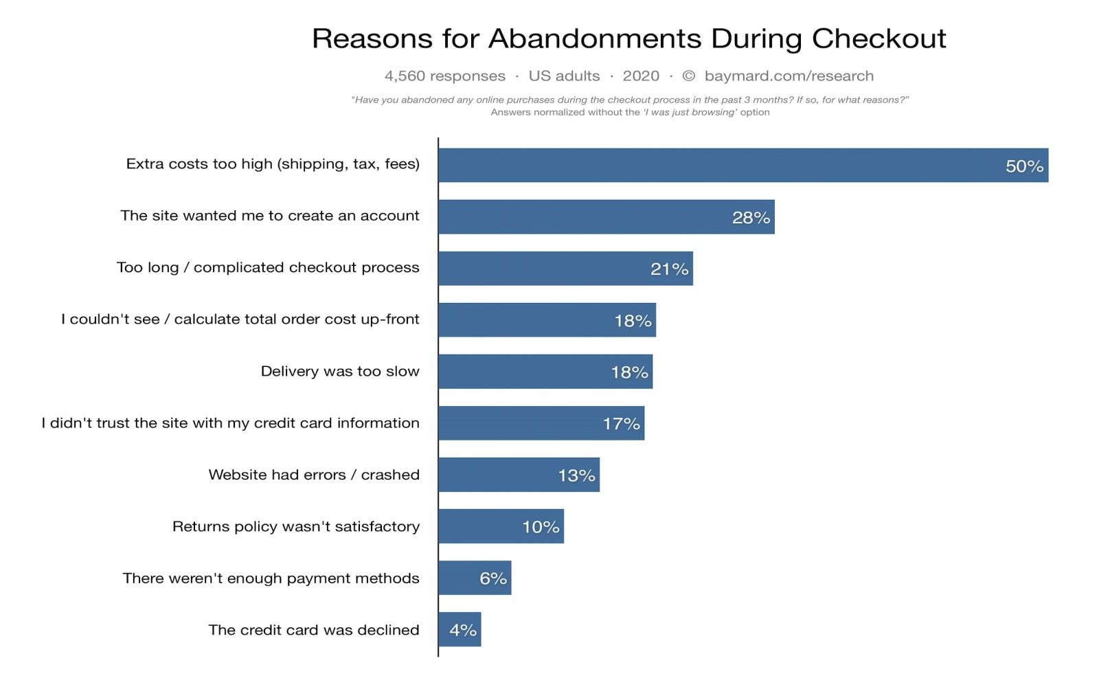
Source: Baymard Institute
If we cross out the problems with the price and delivery policy as well as the category of window shoppers who are just browsing, we’ll see that conversion rates can be improved by optimizing (sometimes just simplifying) user experience. What exactly can a design team do?
Tip # 1. Make a Simple Checkout Page
First of all, a standard checkout process usually contains the following stages:
page view>shopping cart>shipping & billing details>order preview>payment>confirmation
Digital products and services don’t need shipping details since users just download them and the checkout flow becomes shorter. However, there are other ideas for improving the process.
To begin with, do not overload item pages with promotional add-ons. Things like that may work during Black Fridays to enhance the buzz and general excitement. In everyday life, excessive discounts, coupons, promotions can confuse and make people stay on the item page longer.
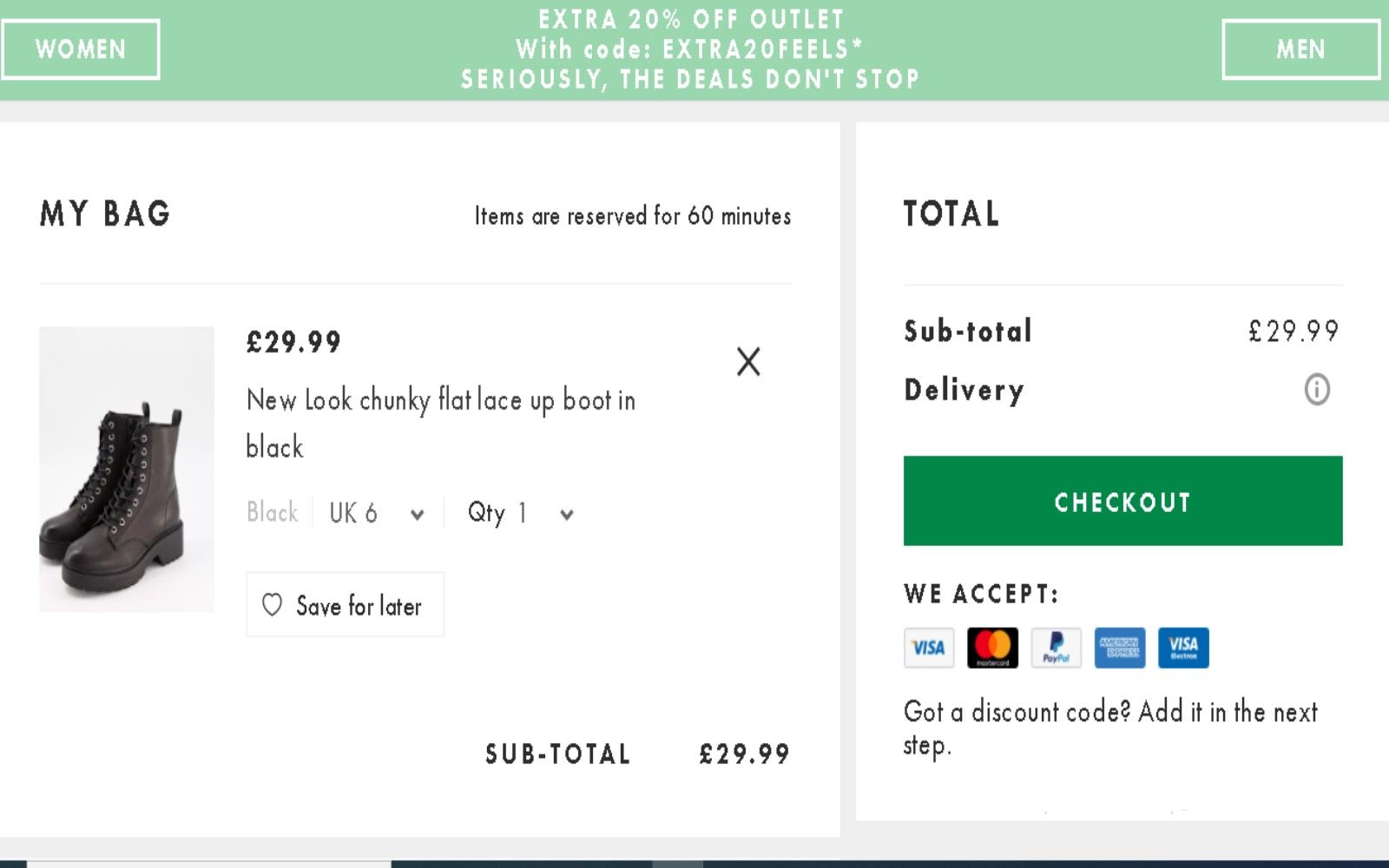
Source: Asos
Another important issue of the checkout process involves forms. When developing an e-commerce store, think about asking the users for less information which means make the forms shorter. Focus on getting a name, an email, shipping & payment details. Excessive fields annoy and frustrate.
Tip # 2. Bury Compulsory Registration in Oblivion
Apart from checkout abandonment, there’s cart abandonment that can have a different nature. Take away unsuitable price & delivery policy, and you’ll get compulsory registration as the most effective way to bring cart abandonment closer. Nearly 30% of consumers admit that they abandon a cart if the last thing separating them from a purchase is mandatory registration.
Registration is usually an inconvenient thing, especially for mobile users. If you still want to keep one when designing an e-commerce store, make it optional when payment has already been done.

Source: Econsultancy
Tip # 3. Tell a Good Story
Your goods or services are the resulting product of your passion, experience, talents. Let customers know how the products you offer will solve their problems and why exactly you offer them. All this means that you should try storytelling principles in your website design.
Speak directly to your customers. Write a background to each product or tell your company’s story but make it personal and readable. Add videos where appropriate. Share personal photos. Do it all within the framework of general website aesthetics.
A personal narrative is the foundation of emotions around a brand. Emotions, in their turn, are important because the customers’ emotional responses enhance their intent to purchase. Moreover, all of us can remember cases when emotions outweigh such factors as a bargain price or trust.
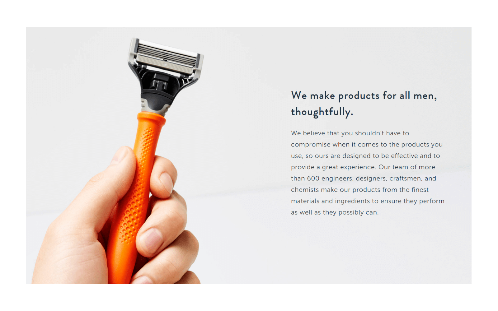
Source: Harry's
Final Words
The UX principles for better conversion rates presented here may turn out to be not that clear and straightforward. Simplicity is the most difficult thing to secure, remember? Implementing new design elements should be thought out and followed by further split testing.
We’re convinced that your online project deserves the best. If our opinions coincide, you must be looking for an experienced e-commerce development company to delegate the whole process. And that’s where Fively is at your service. Let’s talk!
Need Help With A Project?
Drop us a line, let’s arrange a discussion


