
How to Build a SaaS Metrics Dashboard: Key Features, UX Patterns, Metrics and KPIs

• 15 min
I'm a content specialist at Fively keen on writing fresh articles that can help out business and tech specialists. I love to conduct research, hold interviews, and spotlight sophisticated tech issues.
Discover what a SaaS metrics dashboard is, why subscription businesses need one, and the key SaaS metrics and KPIs to include, from MRR and churn to CAC, LTV, NRR, and ARPU.
A well-designed SaaS dashboard turns scattered numbers from billing, product, and marketing into one clear view of business health — so your team stops guessing and starts making data-driven decisions.
Every subscription business runs on a handful of numbers: how much recurring revenue is coming in, how fast customers are leaving, and how much it costs to replace them. But those numbers live in different places — Stripe, your CRM, a product analytics tool, three spreadsheets — and by the time someone stitches them together, the moment to act has passed. A SaaS dashboard solves that: it brings your key metrics into one place, updates them automatically, and gives every team a shared, trustworthy view of what's happening. This guide covers what a dashboard is, which KPIs to track, how to design one people use, and how to choose between a spreadsheet, a BI tool, and a custom build.
What Is a SaaS Metrics Dashboard?
It is a centralized, visual interface that consolidates the key performance indicators of a subscription business — revenue, retention, acquisition, and engagement — into a single, continuously updated view.
Instead of pulling reports from separate systems, teams see metrics and KPIs like MRR, churn rate, and customer lifetime value side by side, usually in real time.
The core idea is consolidation with context. A raw number like "$142,000 MRR" means little alone; a dashboard shows it next to last month's figure and the trend driving the change — the context that turns data into actionable insights.
It's worth distinguishing two related terms. A SaaS KPI dashboard focuses on a curated set of high-level indicators tied to business goals — the numbers leadership manages against. A SaaS analytics dashboard is broader and more exploratory, letting teams slice granular product or usage data to investigate why a metric moved. The best custom dashboards blend both.
Why SaaS Companies Need KPI Dashboards
Subscription businesses live and die by trends, not snapshots — and a dashboard makes those trends visible early enough to act on. Here's why SaaS teams rely on them:
- One source of truth. When finance, product, and marketing all pull from the same dashboard, debates about whose numbers are right disappear — everyone works from a shared definition of each metric.
- Faster, data-driven decisions. Real-time visibility means you spot a churn spike or a stalling conversion funnel in days, not at quarter-end — turning reporting into a tool that drives business growth.
- Early warning on financial health. Recurring revenue, cash flow, and burn are easy to misjudge from gut feel; a dashboard surfaces the leading indicators of trouble before they hit the bank balance.
- Alignment across SaaS teams. Shared KPIs keep departments rowing in the same direction, so priorities get easier to agree on.
- Accountability and focus. A dashboard makes ownership explicit — each metric has a target and a responsible team.
- Investor and board readiness. When it's time to raise or report, a clean dashboard turns a stressful scramble into a five-minute export.
 Services Account
Key SaaS Metrics and KPIs to Include in Your Dashboard
Not every number belongs on a dashboard. The metrics that matter are the ones tied to decisions you'll actually make. Below are the essential metrics most SaaS businesses should track, with a short description and how to calculate each.
Monthly Recurring Revenue (MRR)
MRR is the predictable subscription revenue your business generates each month — the foundation every other revenue metric builds on. How to calculate: sum the recurring revenue from all active subscriptions in a given month. Its annual counterpart, ARR, is simply MRR × 12 and is preferred by enterprise teams and investors.
Customer Churn Rate
Churn measures the percentage of customers who cancel during a period, and it's one of the most honest signals of product-market fit. Small differences compound dramatically, so it belongs on every dashboard. How to calculate: divide the number of customers lost in a period by the number you had at the start, then multiply by 100. Track logo churn (customers lost) and revenue churn (MRR lost) separately.
Net Revenue Retention (NRR)
NRR shows how much recurring revenue you keep and expand from existing customers, including upgrades, downgrades, and churn. Above 100% means your customer base grows revenue even without new sales. How to calculate: (Starting MRR + Expansion MRR − Contraction MRR − Churned MRR) ÷ Starting MRR × 100.
Customer Acquisition Cost (CAC)
CAC tells you how much it costs to win a new customer — the fastest way to judge whether your go-to-market engine is efficient. How to calculate: add up all sales and marketing expenses for a period — ad spend, salaries, commissions, tools — and divide by the number of new customers acquired in that period. A rising CAC without matching conversion or retention gains is an early warning sign.
Customer Lifetime Value (LTV)
LTV, sometimes called CLTV, is the total revenue you can expect from a customer over their entire relationship with your product. It's the counterweight to CAC and guides how much you can afford to spend on acquisition. How to calculate: LTV = ARPA × Gross Margin % ÷ Churn Rate.
LTV:CAC Ratio
This ratio is the clearest read on unit economics: how much a customer is worth versus what it costs to acquire them. How to calculate: divide LTV by CAC. A 3:1 ratio is the common benchmark for a sustainable SaaS business; best-in-class companies reach 5:1 or higher.
Average Revenue Per User (ARPU)
ARPU measures how much revenue a typical customer or account generates, making it essential for evaluating pricing strategy and spotting upsell opportunities. How to calculate: divide total recurring revenue in a period by the number of active users or accounts. Rising ARPU often indicates successful expansion; falling ARPU can flag discounting or a shift toward smaller customers.
Active Users (DAU/MAU)
Daily and monthly active users measure product engagement — how many people actually use your product, not just pay for it. The DAU/MAU ratio is a strong leading indicator of retention and, ultimately, churn. How to calculate: count unique active users per day and per month; the ratio (DAU ÷ MAU) reveals how "sticky" your product is. Low engagement today usually means higher churn tomorrow.
Many teams also add supporting KPIs like conversion rate, CAC payback period, Net Promoter Score (NPS), and the Rule of 40 — but the eight above form the backbone of almost every dashboard.
SaaS Dashboard Examples
There's no single "correct" dashboard — the best design depends on who's looking and what they need to decide. Three common SaaS dashboard examples:
Executive/CEO Dashboard
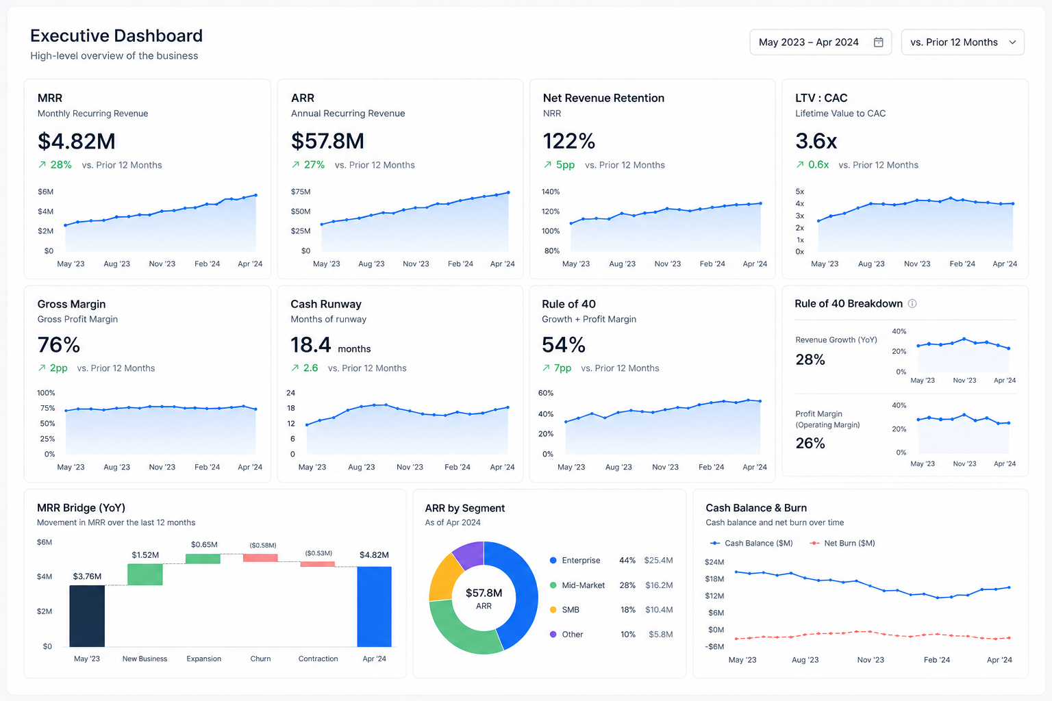
An executive dashboard shows high-level KPIs that summarize the health of the whole business at a glance, favoring trends over snapshots — ideally at least a year of history so seasonality is visible. Include headline metrics like MRR and ARR with growth trend lines, net revenue retention, LTV:CAC, gross margin, cash runway, and the Rule of 40. The goal is a one-screen answer to "how is the business doing?" that leadership can open before any board discussion.
Financial/Revenue Dashboard
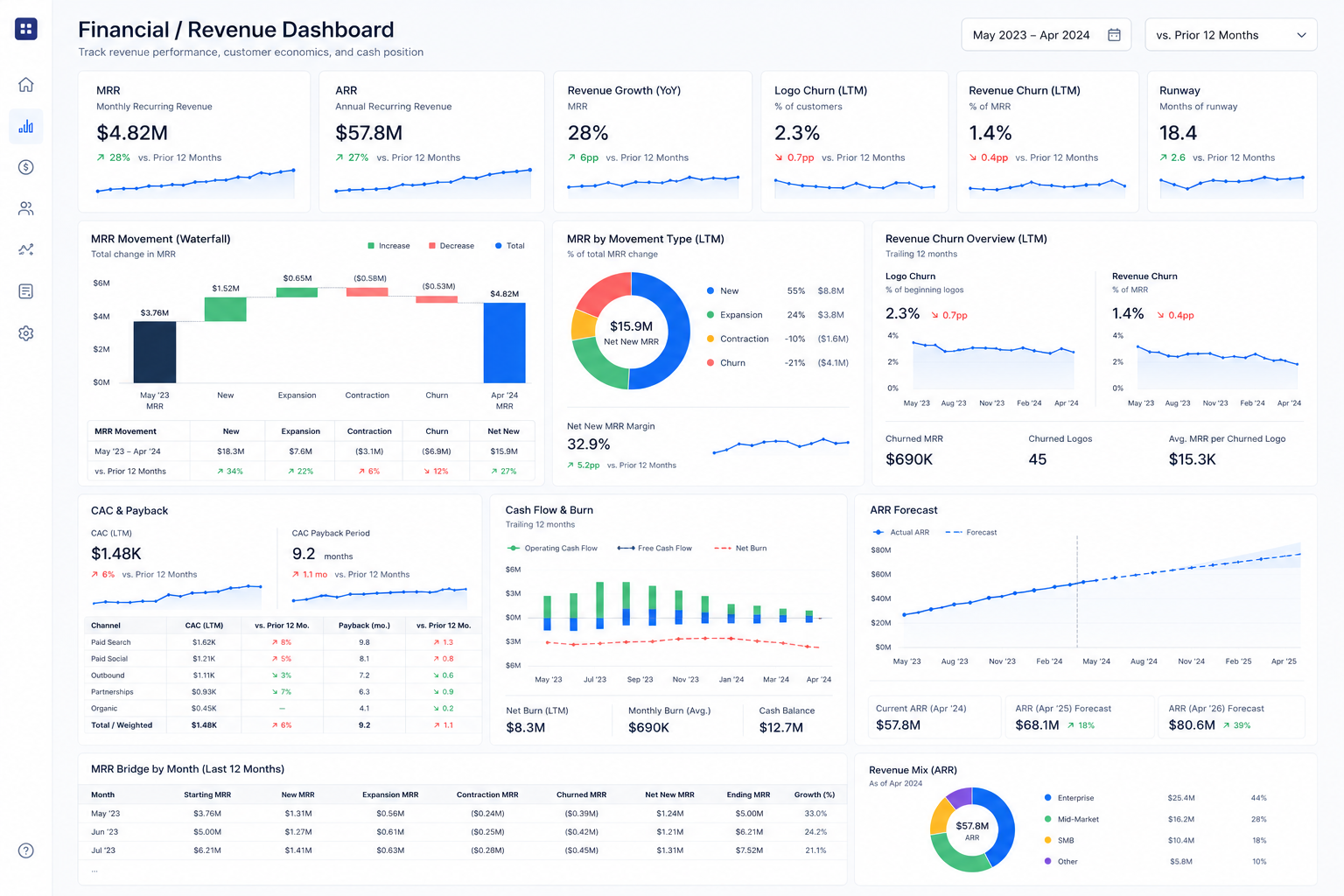
A financial dashboard drills into the money in detail. Built for finance teams, it typically includes MRR and ARR broken down by new, expansion, contraction, and churned revenue; revenue and logo churn; CAC and CAC payback period; cash flow and burn; and forecasting views that project recurring revenue forward. Charts of each revenue movement show whether growth is genuine new business or just replacing churn.
Product/Customer Success Dashboard
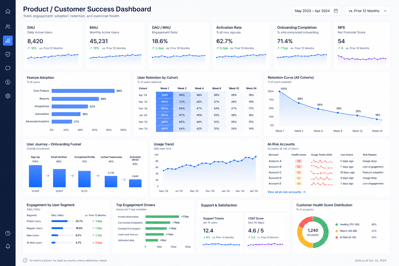
This dashboard focuses on engagement and retention — the leading indicators that eventually show up in revenue. It surfaces active users (DAU/MAU), feature adoption, activation and onboarding completion, retention by cohort, NPS, and at-risk accounts flagged by usage decline. Customer success teams use it to intervene before a customer churns, rather than reacting after the cancellation email arrives.
Spreadsheet vs BI Tool vs Custom Metrics Dashboard
One of the biggest decisions is how to build your dashboard. There are three broad options, and the right one depends on your stage, data complexity, and how central the dashboard is to your operations.
Spreadsheets are where almost everyone starts — perfect for validating which metrics matter before investing further. BI tools and templates are a sensible next step for standardized reporting. But as data sources multiply, definitions need enforcing, and the dashboard becomes something you rely on daily or embed in your own product, the limits of both start to bite. That's where a custom build pays off.
When You Need a Custom SaaS Dashboard
Not every company needs a custom dashboard — but several clear signals suggest you've outgrown spreadsheets and templates:
- Your data lives in many systems. When metrics depend on combining billing, CRM, product analytics, support, and internal databases, manual consolidation stops being viable.
- You need one enforced definition per metric. Only a custom metrics layer can standardize the formulas everyone reports against when MRR, churn, or NRR mean different things to different teams.
- Different roles need different views. Role-based dashboards with the right data and permissions for executives, finance, product, and customer success are hard to achieve in generic tools.
- You want to embed analytics in your product. Showing dashboards to your own customers requires a build you control end to end, with your branding, UX, and security model.
- You need AI and automation. Anomaly detection, forecasting, and natural-language analytics require a platform you can extend — not a fixed template.
- Scale and security matter. Multi-tenant isolation, audit logs, encryption, and performance under heavy data volumes are custom-build territory.
Why custom wins in these cases comes down to fit. A custom SaaS dashboard is shaped around your exact metrics, data sources, and workflows rather than forcing your business into someone else's template. It scales with you, integrates with everything you use, enforces your definitions, and can grow to include AI-driven insights — a long-term asset rather than a reporting stopgap.
 Services Account
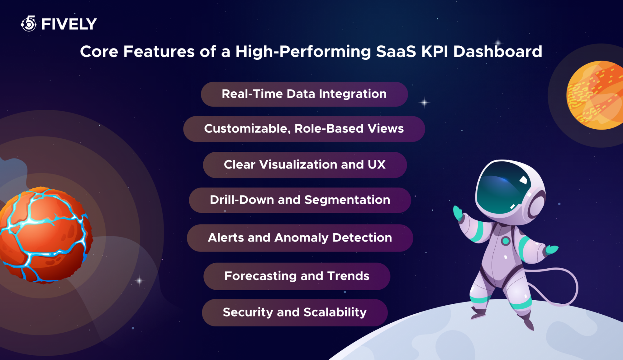
Core Features of a High-Performing SaaS KPI Dashboard
Certain features separate a dashboard people use from one that gets ignored:
Real-Time Data Integration
The dashboard should pull automatically from all your sources — billing, CRM, product analytics, marketing — and refresh without manual work. Real-time or near-real-time data is what makes it trustworthy enough to act on.
Customizable, Role-Based Views
Different teams need different things. Customizable dashboards with role-based access let each user see the metrics relevant to them, with permissions that keep sensitive financial data appropriately restricted.
Clear Visualization and UX
Good dashboards make the important number obvious. Strong visual hierarchy, sensible chart choices, trend lines over raw snapshots, and uncluttered layouts turn data into understanding at a glance.
Drill-Down and Segmentation
Headline KPIs answer "what"; drill-down answers "why." Segmenting by plan, cohort, channel, or region — and clicking from a summary metric into the detail behind it — turns a dashboard into an analytical tool.
Alerts and Anomaly Detection
The best dashboards are proactive. Threshold-based alerts and AI-powered anomaly detection notify teams when a metric moves unexpectedly, so problems get attention before they compound.
Forecasting and Trends
Beyond showing what happened, high-performing dashboards project what's next — forecasting recurring revenue, churn, and growth so teams can plan rather than just react.
Security and Scalability
Especially for embedded or multi-tenant dashboards, encryption, audit logs, tenant isolation, and architecture that holds up as data grows are non-negotiable for a production-grade product.
How to Build a SaaS Metrics Dashboard: Step-by-Step Roadmap
Building a dashboard people rely on is as much about process as technology:
1. Define Goals and Choose Your KPIs
Start with the decisions the dashboard should support, then work backward to the metrics. If you can't name the action you'd take when a number moves, it doesn't belong on the dashboard.
2. Map and Audit Your Data Sources
Identify where each metric's data lives — billing, CRM, product analytics, support — and assess quality and accessibility. This audit surfaces gaps and inconsistencies before they undermine trust in the numbers.
3. Standardize Metric Definitions
Agree on one formula for each KPI. A single, documented definition of MRR, churn, and NRR prevents the "whose number is right?" arguments that quietly erode a dashboard's credibility.
4. Design the UX and Prototype
Sketch the layout around your users: headline KPIs first, logical grouping, clear hierarchy, drill-downs where needed. Prototyping early lets stakeholders react before expensive development begins.
5. Build the Data Pipeline and Metrics Layer
Connect sources through APIs and ETL/ELT jobs, land the data in a warehouse, and implement a metrics layer that calculates each KPI consistently. This engine keeps the dashboard accurate and automated.
6. Develop the Dashboard Interface
Build the front-end — typically in React and TypeScript — with the visualizations, filters, and role-based views your design calls for. This is where clean UX turns raw data into something teams enjoy using.
7. Test, Validate, and Launch
Validate every number against source systems, test across roles and devices, then roll out with onboarding. A dashboard people don't trust is a dashboard people ignore.
8. Iterate and Extend
Treat the dashboard as a living product. Gather feedback, refine metrics, and layer in advanced capabilities like forecasting and AI insights as your needs grow.
 Services Account
Recommended Architecture for a Custom KPI Dashboard
A production-grade custom dashboard follows a clear data flow:
CRM + Billing + Product Analytics + Support → Data Pipeline → Warehouse → Metrics Layer → Role-Based SaaS Dashboard → Alerts & AI Insights
The key building blocks:
- Data sources. CRM, billing (e.g. Stripe or Chargebee), product analytics, support, marketing platforms, and internal databases.
- Data pipeline. API connectors, webhooks, and ETL/ELT jobs that extract, transform, and load data on a schedule or in real time.
- Storage. A warehouse such as PostgreSQL, Redshift, BigQuery, or Snowflake, chosen to fit your data volume.
- Metrics layer. A standardized set of KPI formulas so every metric is calculated once, consistently, and reused everywhere.
- Backend. Node.js, Python, .NET, or Ruby on Rails, depending on your existing stack.
- Frontend. React and TypeScript dashboards delivering fast, interactive, responsive visualizations.
- Cloud and DevOps. AWS or GCP with Docker and CI/CD for reliable, repeatable deployment.
- Security. Role-based access control, audit logs, encrypted data, and tenant isolation for multi-tenant products.
- AI layer. Anomaly detection, forecasting, and natural-language analytics for plain-English questions and answers.
This architecture is modular: you can start with the core pipeline and dashboard, then add the AI layer or embedded analytics as your needs mature — without re-platforming.
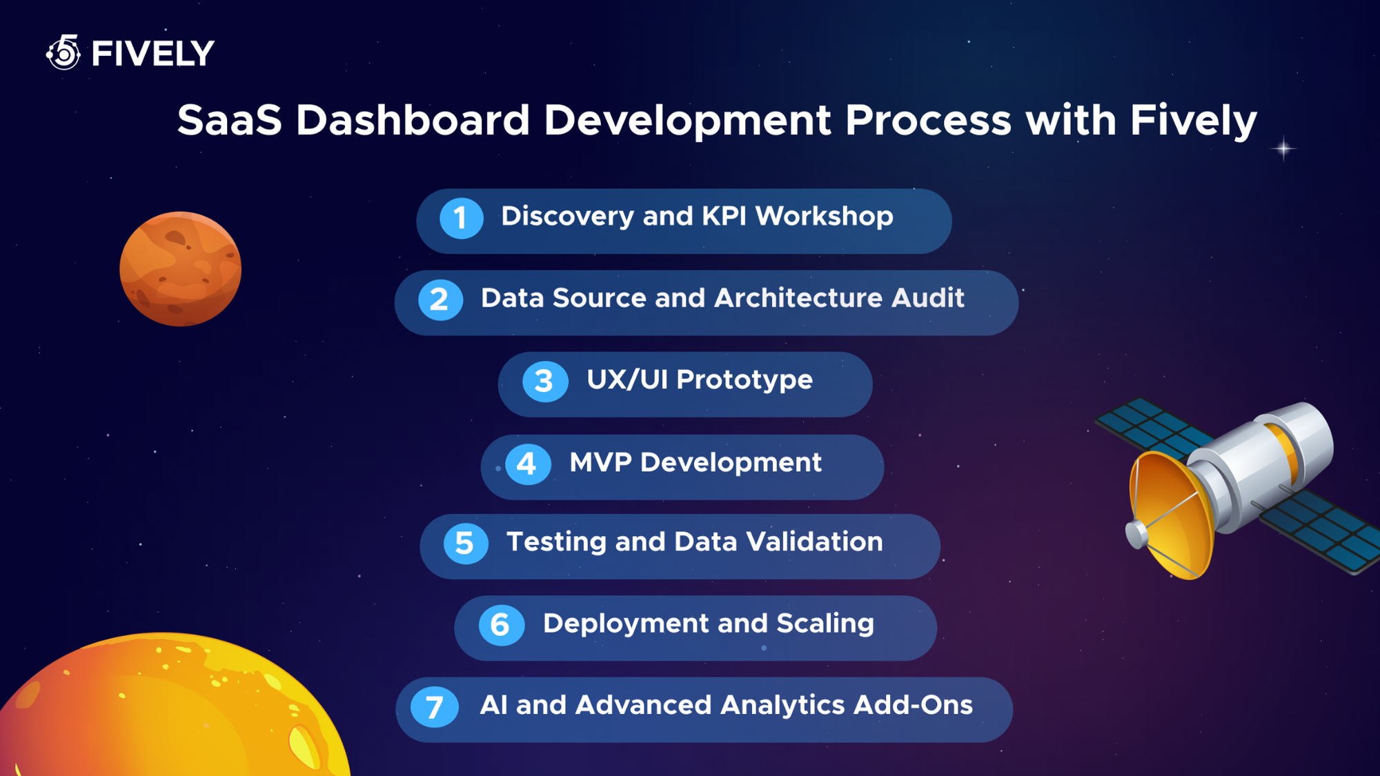
SaaS Dashboard Development Process with Fively
Building one combines data engineering, UX, and product thinking. Here's how our team approaches it:
Discovery and KPI Workshop
We align on the decisions your dashboard must support, then define the exact KPIs, definitions, and user roles together — anchoring the build to business value from day one.
Data Source and Architecture Audit
We map every data source, assess quality and accessibility, and design the pipeline and storage architecture that fits your stack, data volume, and scaling needs.
UX/UI Prototype
Our designers turn the agreed KPIs into an intuitive, role-aware interface, prototyped early so you can validate the experience before development ramps up.
MVP Development
We build a working dashboard focused on your highest-value metrics first, so you get something real and usable quickly rather than waiting for a big-bang launch.
Testing and Data Validation
We validate every metric against source systems and test across roles and devices — because a dashboard is only as valuable as the trust people place in its numbers.
Deployment and Scaling
We deploy to your cloud environment with monitoring, security, and CI/CD in place, and ensure the architecture holds up as data and users grow.
AI and Advanced Analytics Add-Ons
Once the core is solid, we extend it with forecasting, anomaly detection, and natural-language analytics — turning a reporting tool into a system that surfaces insight proactively.
Fively has built data-heavy, analytics-driven products across industries — from a data visualization web app for a nature-restoration company that visualized the impact of planting over 113 million trees, to an AI-powered search and web-analytics SaaS and a real-time interactive presentation tool. That mix of data engineering, clean UX, and AI is exactly what a high-performing dashboard demands.
Common Mistakes When Building SaaS Dashboards
Even well-resourced teams get dashboards wrong in predictable ways:
1) Tracking too many vanity metrics. Cluttering the dashboard with numbers that look impressive but drive no decisions buries the metrics that matter — be ruthlessly selective.
2) Mixing KPIs and raw metrics without context. A number without a trend, benchmark, or comparison is noise; every metric needs context to be actionable.
3) No single definition for key metrics. When MRR, churn, and NRR are calculated differently across teams, the dashboard loses credibility — standardize definitions before you build.
4) No role-based views. Showing every team the same wall of data means most of it is irrelevant to most people; tailor views to roles.
5) No data quality checks. The most reliable numbers come from validated primary sources — skip this and one wrong figure erodes trust in the whole dashboard.
6) Building in a silo. A dashboard designed without input from the people who'll use it rarely fits how they work; involve finance, product, and marketing from the start.
Conclusion
A SaaS metrics dashboard isn't a reporting nicety — it's operational infrastructure. In a subscription business, the gap between thriving and struggling often comes down to seeing the right numbers at the right time and acting on them before the window closes. The best dashboards consolidate your data, enforce consistent definitions, surface trends and anomalies, and give every team a shared, trustworthy view of the metrics that matter.
Whether you start with a spreadsheet, adopt a BI tool, or invest in a custom build, the goal is the same: turn scattered data into confident, data-driven decisions. And when you outgrow templates — when your data spans many systems, your definitions need enforcing, and you want AI-driven insight embedded in a dashboard you control — that's where a custom solution earns its keep. If you're ready to build a dashboard tailored to your business, Fively can help you design, build, and scale it.
 Services Account
Need Help With A Project?
Drop us a line, let’s arrange a discussion
Frequently Asked Questions
A SaaS metrics dashboard is a centralized, visual tool that consolidates the key performance indicators of a subscription business — like MRR, churn, CAC, and LTV — into a single, continuously updated view. It pulls data from systems such as billing, CRM, and product analytics, calculates each metric consistently, and presents them so teams can make data-driven decisions without manually assembling reports.
Most dashboards should include core revenue, retention, and acquisition metrics: MRR and ARR, customer and revenue churn, Net Revenue Retention (NRR), CAC, LTV, the LTV:CAC ratio, ARPU, and active users (DAU/MAU). Many teams add conversion rate, CAC payback period, and NPS. The right mix depends on your stage and the decisions the dashboard needs to support — track what you'll actually act on.
The first one focuses on a curated set of high-level indicators tied to business goals — the headline numbers leadership manages against. A SaaS analytics dashboard is broader and more exploratory, letting teams dig into granular product or usage data to understand why a metric changed. KPI dashboards answer "what's happening?"; analytics dashboards answer "why?". Strong custom dashboards combine both.
Use a BI tool when you need standardized reporting quickly and your data sources are limited. Build custom when your data spans many systems, you need enforced metric definitions, role-based views, embedded analytics for your own customers, AI capabilities, or serious scale and security. A practical path: start with a spreadsheet or BI tool to validate what matters, then invest in a custom build once the dashboard becomes central to how you operate.
Yes. Fively builds custom metrics dashboards end to end — from data pipelines and metrics layers to React-based interfaces — and extends them with AI features like anomaly detection, forecasting, and natural-language analytics. With experience across data-visualization, SaaS, and AI projects, our team can design a dashboard around your exact KPIs, integrations, and roles, and scale it as your business grows.


